Web · Arbisoft
AWN Collective
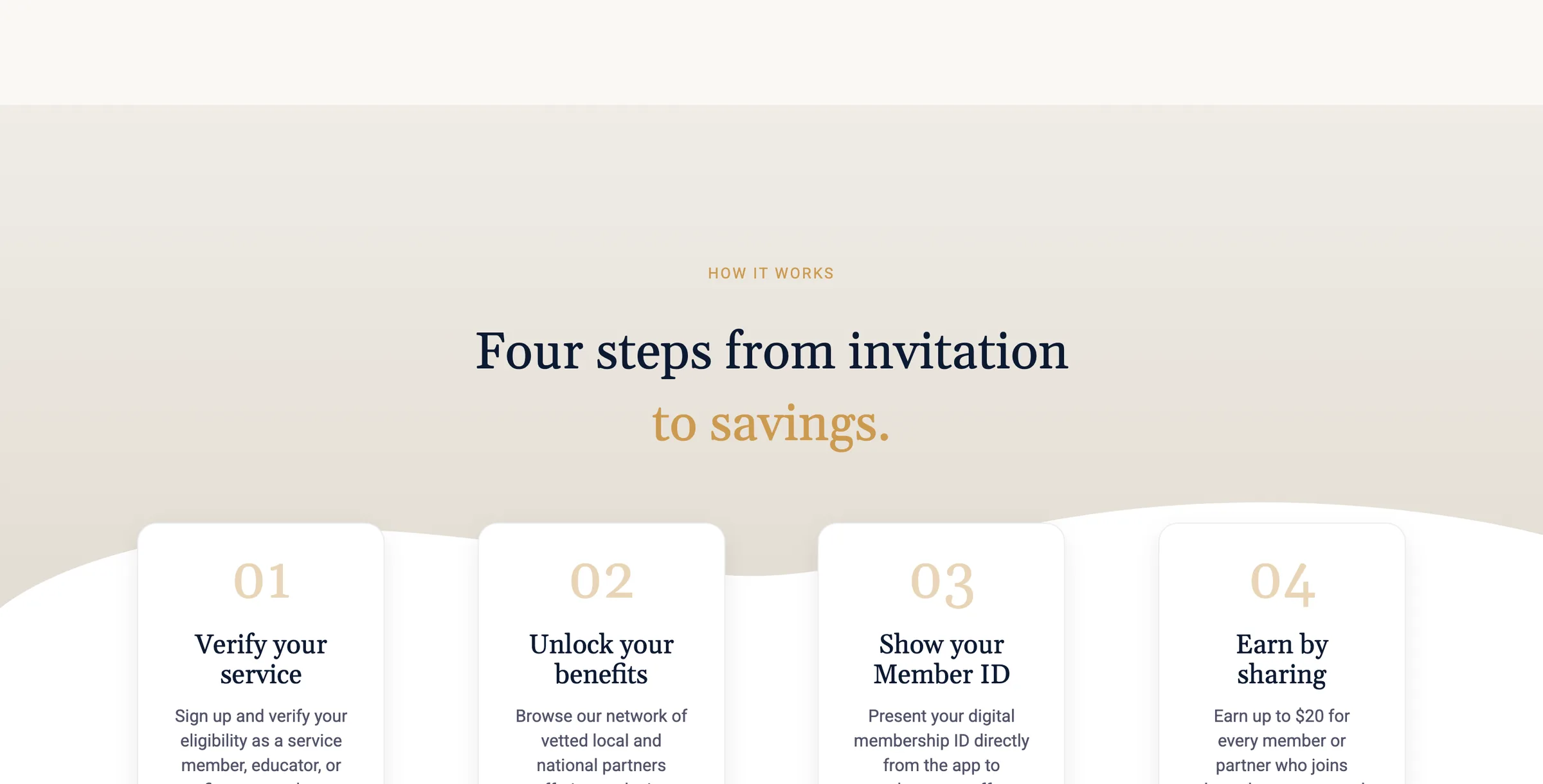
Marketing site for a membership program that connects Islamic scholars, students of knowledge and educators with discounts from vetted partners. Built in Webflow from Figma.
Key decisions
- Used Webflow Designer styles instead of custom code, so the client's team can keep editing without a developer.
- Made tablet the first full responsive pass and kept mobile overrides to what actually changes.
- Fixed card clipping with flexible tracks and capped widths instead of adding another breakpoint.
- Role
- Built the marketing site in Webflow from the Figma designs, including shared components and every responsive breakpoint.
- When
- Aug 2026
- Links
- Stack
- Webflow, Figma, CSS
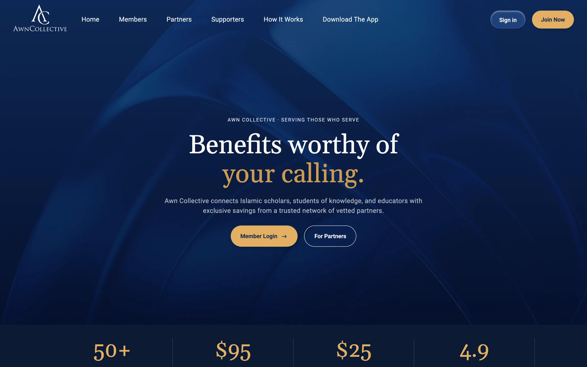
AWN Collective needed its marketing site live before the member app: home, members, partners, supporters, how it works, download, a coming soon page for sign in and the legal pages. Designs came from Figma at desktop, tablet and mobile sizes.
What this was
This was mostly delivery work rather than a hard engineering problem. The job was matching the design closely and leaving a site the client's team can keep editing in the Webflow Designer without needing a developer.
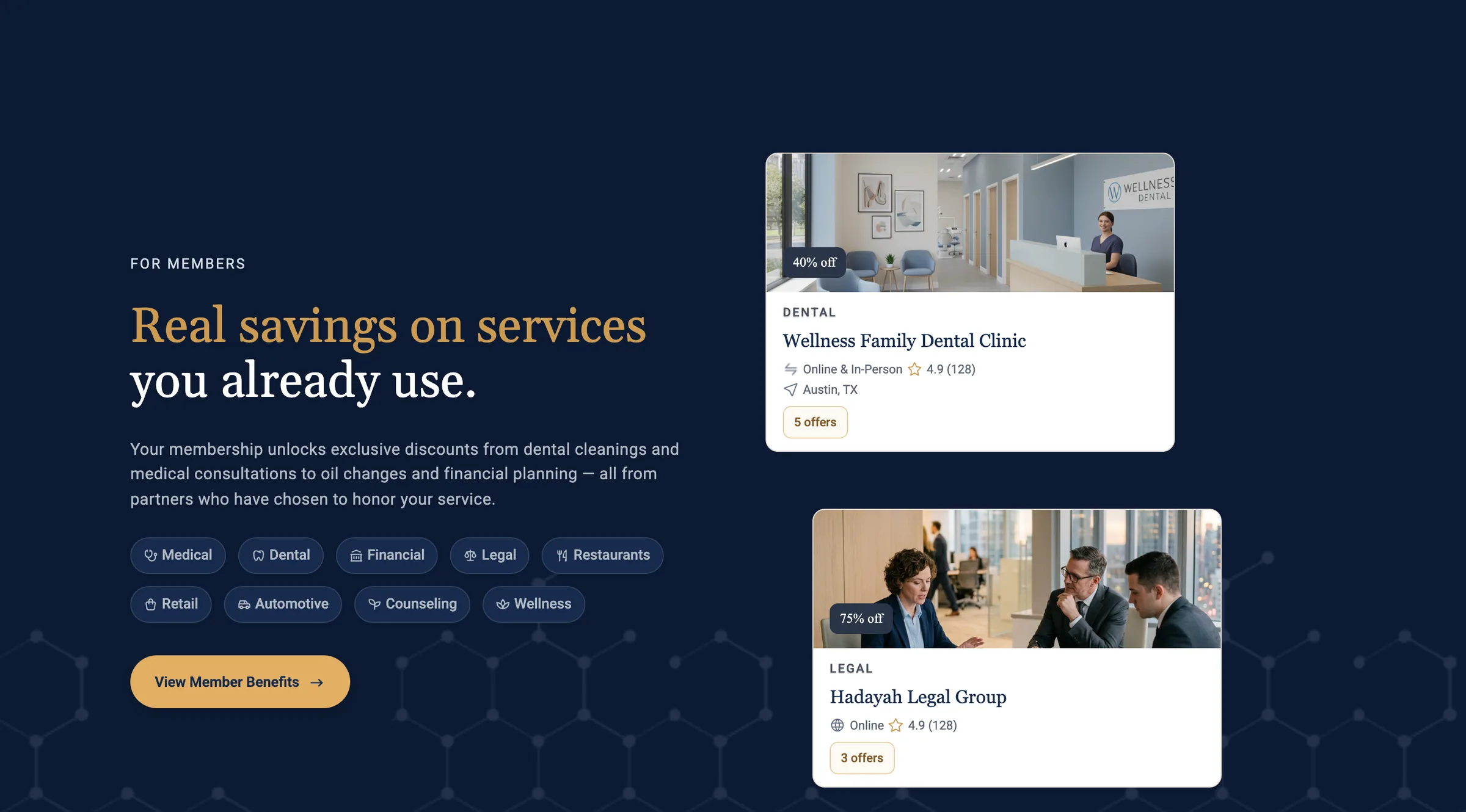
How it was built
- Designer styles over custom code. The class system mirrors the Figma components, with explicit button variants like gold, navy and outline, so changes happen in Webflow rather than in a code embed. Custom code is limited to what Webflow can't do natively, like the mobile footer accordion.
- Shared header and footer components across every page, with page level variations done by detaching an instance rather than rebuilding it.
- Tablet is the first full responsive pass and the two mobile breakpoints only override what has to change. Content never uses absolute positioning.
- Decorative waves are repeating section backgrounds and watermark logos sit in a contained layer, so neither drifts as the viewport width changes.
- Desktop card rows used to clip just above the tablet breakpoint. Flexible tracks,
min-width: 0and capped card widths fixed it without adding another breakpoint. - Wide tables like the partner ROI table scroll horizontally inside their card on mobile instead of being rebuilt as stacked rows.